I’ve never been one to follow rules. I’ve always felt
photography was more about feeling then it was about formula. Even in the dark
room, I never use timers, thermometers, or any of that fancy science stuff.
Photography is too organic for that. However, looking back at some of my work,
I realize that I did “follow” the rules more then I thought. Why, because the
rules make sense. They are aesthetically pleasing, and in that split second
when you are trying to grab that shot, having the rules in the corner of your
brain means one less thing to think about. Does this mean you should follow
them all the time? Of course not. Is your picture wrong or bad if you don’t
follow them? Not at all. So what good are they? Simple, the “rules” are things
to remember to give your photo that... feel. So love it or hate it, here is my photocomposition tutorial.
The Rule Of Thirds:
Ah the rule of thirds. Look at an image, and divide it into
9 even blocks using 2 evenly spaced vertical lines, and 2 evenly spaced
horizontal lines. Then try and line up your scene to these lines. The important
things will work best on the intersection of these lines. Eyes, text, product,
whatever it is you want the user to focus on, put it on those intersections. In the photo on the right, of the Station fire in Los Angeles, I sis not use any of the intersecting points, but the photo is clearly divided into thirds.
Off With Their Head!
 When photographing people, or animals, pay attention to the
bodies natural joints. Avoid cropping your pictures at the neck, elbow, waist,
or knees. Instead, try to crop at places halfway between the joints. Cutting
off at a bend point gives a severed feel to the image. While on the subject of
body positioning, another good photo composition tip is to leave nose room. If
your subject is looking from one side of the frame to the other, always leave
room for them to look. Have more in the direction they are looking then behind
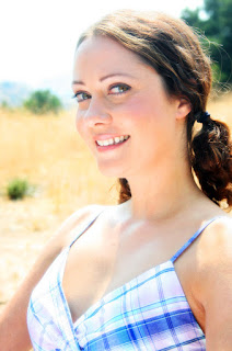
them. In this photo, the subject (model Regina Bailey) looks comfortable, and natural. There is plenty of breathing room in front of her face, and the photo cuts off midway between her neck and elbows. As a general rule of thumb, a close-up is head and shoulders, a medium is from head to just above the waist, a "cowboy" shot is head to mid thigh, and a wide shot gets the whole body.
Patterns.
Pattern, symmetry, repetition, and lines that direct your
viewers’ eye. These are all things that can be found in subtleties of
landscapes (both rural and urban.) Utilize these things. Show your viewer the
winding road ahead, or point them at the woman on the balcony. Vertical lines
show strength and power, while horizontal lines convey serenity. Diagonal lines
show action, and curves have a serene sensuality to them. Converging lines have a
sense of contemplation and the unknown.
Depth of Field
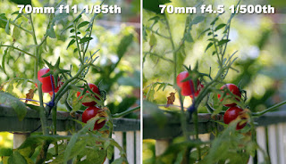
 Depth of field is what is perceived to be in focus in your
image. Although a camera can only be focused on one point in space at a time, a
wider depth of field will make more of the picture appear to be in focus. The
size of your image plane (piece of film, or digital sensor) plays a part in
depth of field, with a smaller image plane providing a wider depth of field and
a larger image plane providing a narrower one. A wider angle lens will also
increase the depth of field as will a smaller aperture. Throwing things out of
focus is a great way to make sure your viewer is looking at what you want them
to look at. So if you want that background to go out of focus, zoom in and open
your iris. You can raise up your shutter speed to compensate for the wider
aperture or us Neutral Density filters)
I’m sure some people will say these aren’t important, and
some will say I’m leaving out the most important things. Truthfully, I don’t
think about rules. I keep them in a corner of my brain, and when I raise the
camera to my eye to frame a shot, they come out like a reflex. The camera
raises or lowers to line up the natural elements of the scenes, I zoom in or
out a bit, or step on way or the other. And these elements fall in line. It is
what makes the image pleasing, and as long as you look through your viewfinder
and try to find the most pleasing angle, and try to tell a story in you
photograph, you will find that these rules will have applied themselves.
Photography is organic, and when all the elements fall together, it is a
priceless tool to tell a story.


No comments:
Post a Comment